Product Design UX / UI Design

Benefits Table

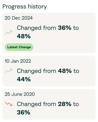
A benefits table rich with data that lets users quickly scan key company offerings by featured benefits, with the option to explore deeper insights when desired and follow an employer they want updates on.

View live page
CompanyWORK180
Year2025
Tasks
Product researchWireframingUX UI DesignPrototypingWorkshopsStakeholder managementCollaboration with engineersA/B test

Overview

WORK180 have a comprehensive dataset on employer benefits, but the previous benefits table was static, difficult to interpret, and full of industry jargon that didn't resonate with job seekers.

Objective

Redesign the benefits table to transform a static, hard-to-understand product into a dynamic research tool that empowers our community to make informed decisions.

  • Empower job seekers to make informed decisions based on the benefits that matter most to them.
  • Help employers clearly communicate their value propositions and increase engagement.
Problem
While we had high-quality data about employer benefits, the previous table design failed to communicate it effectively. The data was difficult to interpret, lacked context, and used industry-heavy language that didn't resonate with employer & job seekers.
Business goal
Improve clarity and usability of the benefits table, increase user engagement, and better showcase the unique offerings of each company โ€” helping employers stand out for the benefits they provide.

Process

As the Lead Designer, I led the redesign from discovery through to implementation, collaborating closely with Product, Engineering, Marketing, and our DEI advisory team.

Discovery
Used insights from Hotjar recordings, support queries, surveys, and past research to understand pain points and areas of confusion.
Design Workshops
Facilitated cross-functional sessions to identify opportunities and define high-impact, low-effort solutions.
User Flows & Wireframes
Mapped out simplified user journeys and structured content in a way that supported progressive disclosure and comparison.
Prototyping & Feedback
Developed interactive prototypes and ran internal review sessions with key stakeholders to validate direction.
UI Design
Created a clean, accessible, responsive design using WORK180's brand system, with a clear hierarchy and built-in tooltips for deeper context.
Collaboration & QA
Worked closely with Engineering to ensure smooth implementation, documented edge cases, and supported for launch-readiness.
Content Review
Partnered with Marketing and our DEI advisor to rewrite content using inclusive, plain language that's easy to understand.
Components
Scroll to explore
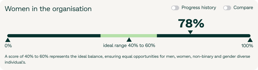
Benefits table component 1
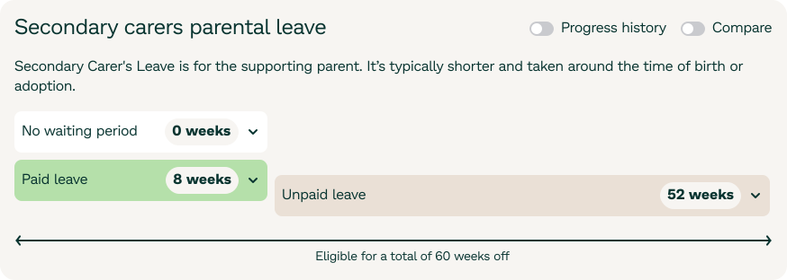
Benefits table component 2
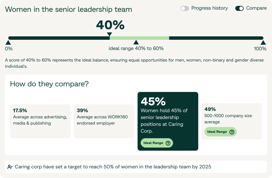
Benefits table component 3
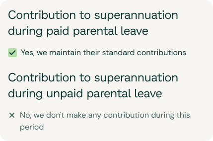
Benefits table component 4
Benefits table component 5

Outcome and impact

Improved User Experience
The redesigned table transformed a static list into an interactive research tool, making it easier for users to explore and compare benefits that align with their needs.
Boosted Employer Visibility & Engagement
Employers could now showcase their benefits more clearly, while users gained the ability to follow companies โ€” driving ongoing engagement and repeat visits.

Key takeaways

01
Context is key
Presenting data with plain language, clear icons, and meaningful grouping helped users feel informed rather than overwhelmed.
02
Data should tell a story
Visualising employer benefits with benchmarks and consistent formatting made it easier to highlight what made each company unique.
03
Cross-functional collaboration matters
Involving product, design, marketing, and sales early helped ensure the solution met user needs while supporting business objectives.

Next steps

โ†’Explore benefit-based notifications and personalisation based on user interests and followed employers.
โ†’Monitor user interaction trends post-launch.
Quick Interview
Common questions recruiters ask.
Click any to see my answers instantly.

I'm a product designer with 10 years across freelance, in-house, and startup environments. My background spans product strategy, UX research, UI design, branding, and illustration so I can carry an idea from a whiteboard conversation all the way to a shipped, on-brand interface.

I'm currently a Product Designer at WORK180 in Melbourne, working end-to-end on the employer-facing platform from discovery and research through to delivery and iteration.

Because I don't just design screens I think about outcomes. I started in visual and brand design, which means I care deeply about craft and polish. I grew into UX and product, which means I care about whether it actually works for people and moves the business.

I'm also fluent with AI-enabled workflows and front-end enough to communicate precisely with engineers. I move fast without dropping quality, and I thrive in teams where design and engineering are genuinely collaborative.

Discovery first I want to understand the problem, the users, and the constraints before I sketch a single screen. That means research, stakeholder conversations, and auditing what already exists.

Then I move fast in low-fidelity: flows, rough wireframes, quick prototypes for testing. High-fidelity comes after we've validated the approach, not before. And I stay involved post-launch data and user feedback inform the next iteration.

As a partner, not a handoff machine. I try to involve engineers early ideally in problem framing so they're invested in the solution, not just implementing a spec.

I'm comfortable reviewing implementations for design fidelity and adjusting specs when engineering constraints make something impractical. I'd rather ship something slightly simpler and well-built than something pixel-perfect and brittle.

The challenge
We identified an opportunity to help young people find the right apprenticeship path with full transparency, while giving employers a way to manage applications on the other side. The tricky part was that it's a two-sided product with very different user needs, and we jumped straight into it as an experiment with almost no runway. I had a week to show a working prototype to a potential client, starting from scratch.

What I did
I ran discovery and scoped the project myself, mapping out both sides of the experience simultaneously. I had to make fast, pragmatic calls about what to explore and what to park, and built the prototype end-to-end to get something tangible in front of stakeholders quickly.

How it evolved
The whole process has been learning while building, taking feedback from research and changing direction based on what we found rather than following a fixed plan. That's been the real design challenge: staying structured enough to make progress while staying loose enough to respond to what we learn.

Where it landed
We're currently in validation with some strong early signals. It hasn't shipped yet but the process itself validated a lot of our assumptions about what both sides of the market actually need.

Range, and where I sit between disciplines. I started in visual and brand design, so I have a strong eye for typography, layout, and polish but I grew into UX, design systems, and front-end, so I can carry an idea from a stakeholder conversation all the way to a built, accessible, on-brand interface.

That blend matters for work that lives between marketing, communications, and product. I'm also a systems thinker who still sweats the pixels.